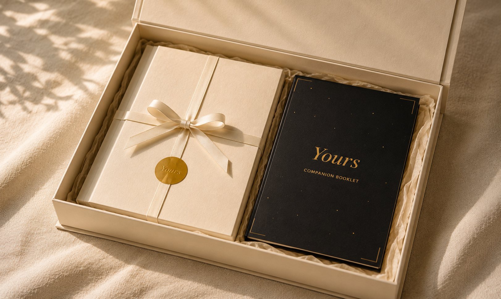
A keepsake brand for the things a mother means to write down and never does.
Yours is an editorial keepsake brand for mothers who want to preserve what matters in their family. This is Edition I of its first product, A Book of Letters — brand system, product design, illustration direction, packaging and press-ready artwork.
- Role
- Independent product designer — product strategy, content design, visual system, illustration direction, packaging, print production, and the brand site.
- Scope
- Concept through press-ready artwork and a live bilingual brand site, 2025–2026.
- Status
- Edition I, at physical proof.
- Live at
- yourskept.com ↗
It began with two children — one who treasures cards, and one who sees paintings.
My daughter treasures cards. The ones she is given. The ones she gives. She makes art the way other children breathe — constantly, instinctively. She is the reason this is a book of letters, made of cards.
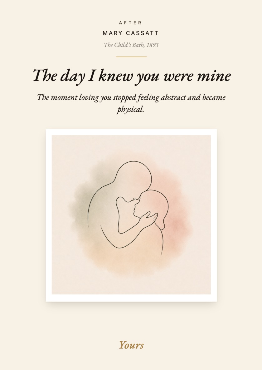
My son cannot yet read. There was a children’s book of art in our house. He stopped on Mary Cassatt's The Child's Bath. He looked, and looked, and connected. He sees things — silently, completely — that adults stop seeing. He is the reason this is a book about paintings.
A child does not need words to recognize tenderness. They need to be shown that the way they are loved has always existed — that other parents have held their children the same way, in different rooms, in different centuries, with the same care.
The problem was never memory. It was the blank page.
Even when we try — the baby book, the keepsake journal, the milestone diary — the format defeats us. We open them, see fifty blank pages, and close them again. Too many pages. Too little time. Too much pressure to write something worth keeping.
A note saved in a phone disappears with the phone. A document can preserve information; an object can preserve intention. That is the whole argument for making this out of paper.
How might writing one memory feel small enough to begin, while producing an object worth keeping?
Three parts, one system.
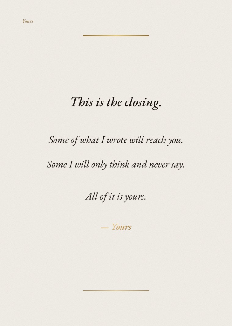
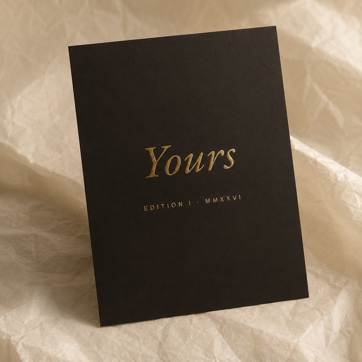
Sixteen cards: fourteen prompt cards, each naming one thing a mother might want to tell her child, plus a dedication card and a closing card in gold foil. A companion booklet that carries every opening again — its painting, three smaller ways in, and one example written in another mother's hand. A keepsake box that holds all of it.
The cards travel. The booklet stays with her.
A Book of Letters, Edition I.
It is designed to be opened at five, returned to at fifteen, and held again at fifty. The illustrations are simple enough for a young child to read — and quiet enough to hold an adult's attention.

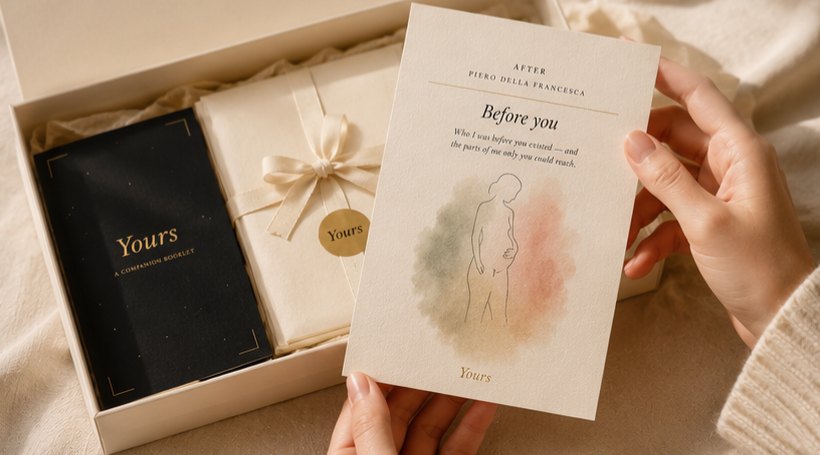
Fourteen openings, not fourteen blank cards.
A blank card asks you to think of something. A named one hands you the thought and gets out of the way.
Naming the opening is what gets her started, and it also decides what she starts on. Fourteen named openings are fourteen doors, which means they are also fourteen walls. What she most wants to say may not be among them, and the set will not help her find it. The booklet answers that directly: there is no correct way to complete Yours.
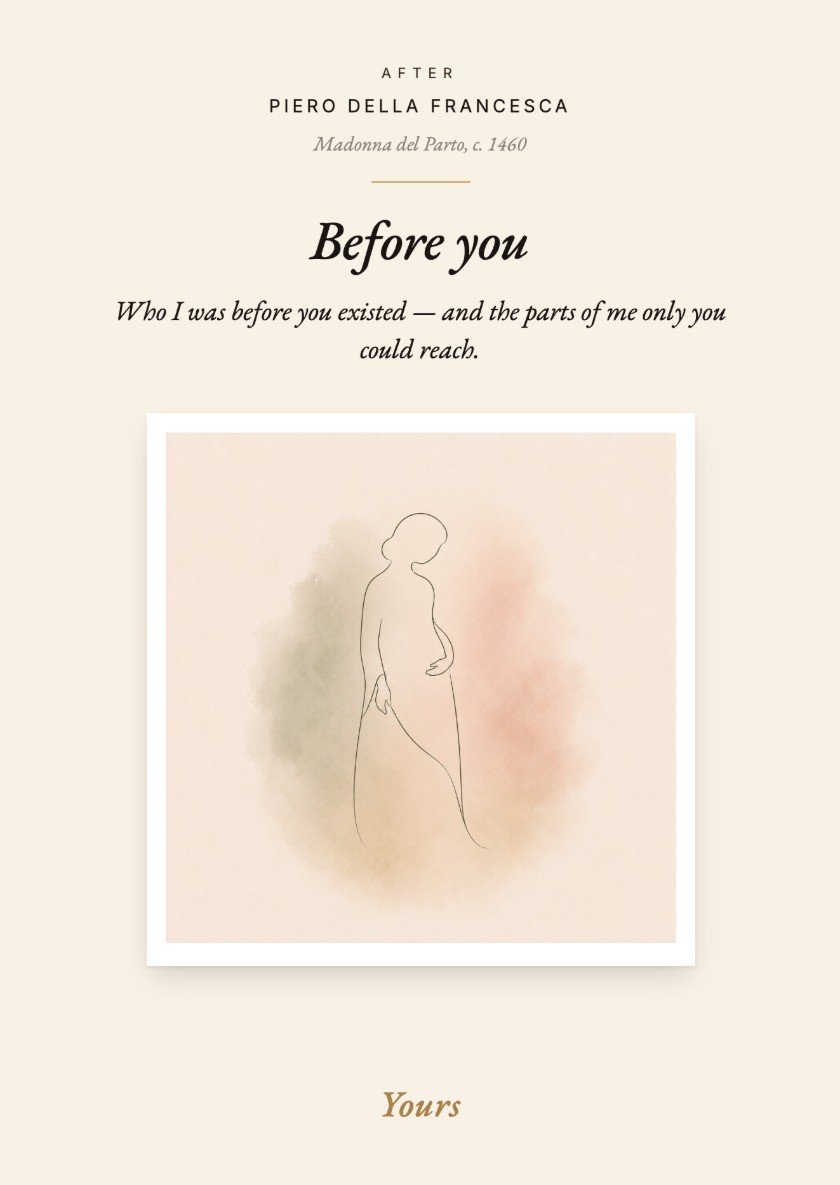
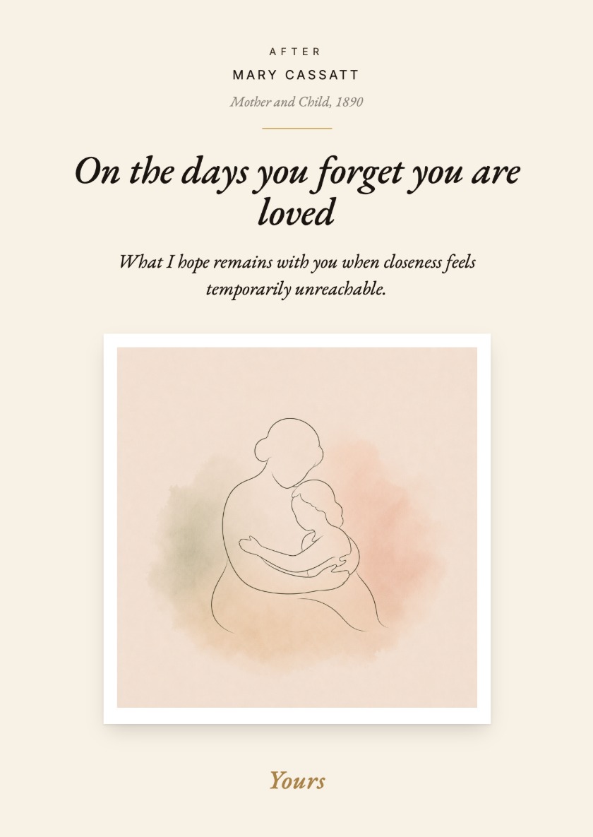
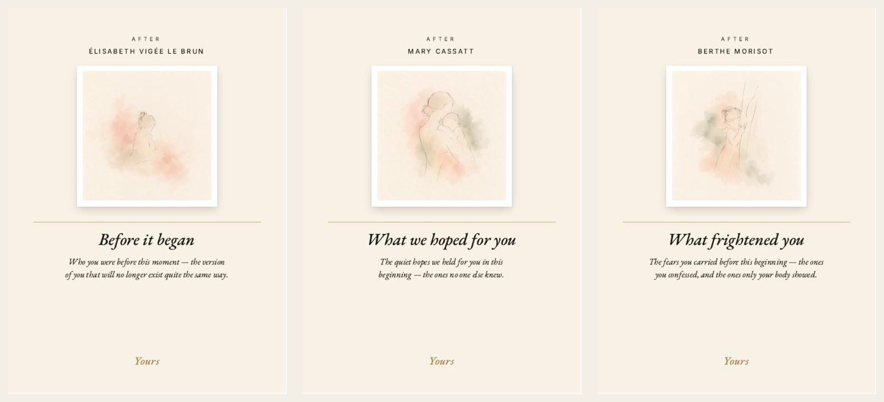
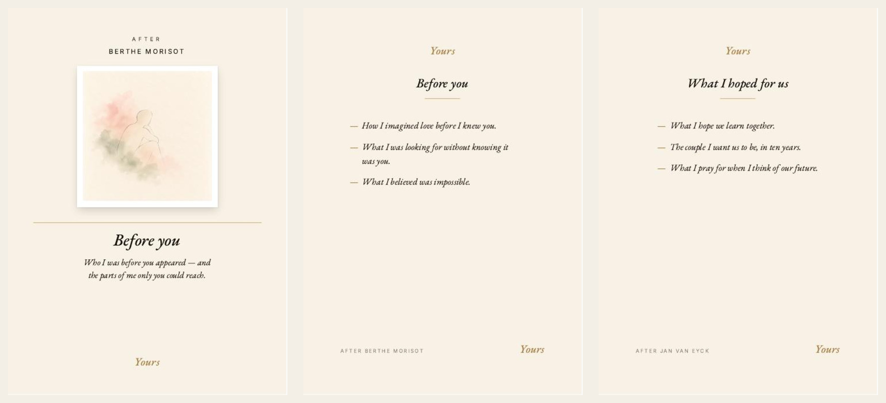
The fourteen prompt cards are A6, and each front carries its credit, its title, one line of prompt, and the illustration inside a white polaroid border.
The scaffolding runs two levels deep. The front names the opening. The back repeats it and offers three smaller ways in — one memory, one change, one thing that only appeared afterwards — and then stops, and the rest of the card is hers.
A6 puts a ceiling on the letter. What fits is a paragraph, not a page. That limit is the reason the companion booklet exists — the card holds what she wants him to read, the booklet holds the rest.
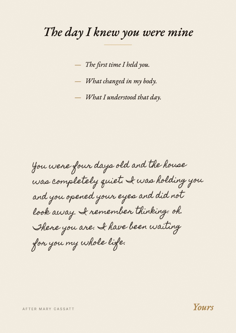
The booklet is where the writing is taught.
The cards name the opening. The booklet shows what one looks like when it is finished. Each entry carries the same structure — the painting it is drawn after, the prompt, three ways into it, and one worked example set in handwriting, so the page shows a written answer instead of describing one.
A finished example removes the fear of the first sentence and replaces it with someone else's voice. The risk is imitation — that she writes toward the example instead of toward her child. The booklet names the risk rather than hiding it: the example is not a model, it is permission.
Why these, and not others.
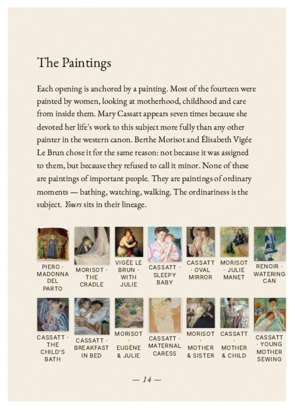
The fourteen paintings span four centuries. They were chosen for one reason: each one holds a specific gesture that does not change with time — the arc of cradling a sleeping head, the angle of bending over a small body, the closed circle of an embrace.
None of these paintings are of important people. They are paintings of ordinary moments — bathing, watching, walking. The ordinariness is the subject.
The credits read After, not Of. The illustrations are interpretations drawn from these painters' emotional language, and the research set the illustration brief: single-line readings of the gesture, not reproductions of the surface.
One italic serif, set once, at the size it was drawn for.
Card titles are EB Garamond Italic. Everything else on the object — credits, editions, running labels — is a fine sans in small caps, letter-spaced wide enough to read as a label rather than as text. Two voices, and they are never asked to do each other's job.
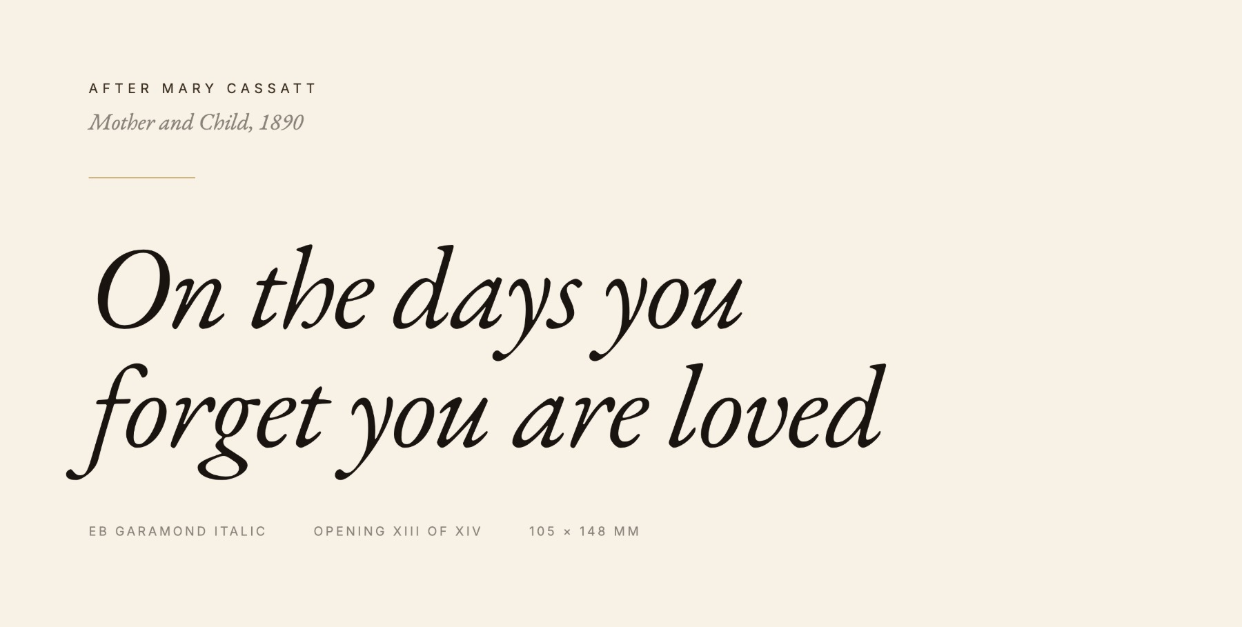
Three values. Only one of them is ink.
Cream is most of what you touch, and that is the point: it is the surface she writes on, so it has to feel like paper rather than like design, and it is uncoated for the same reason. The warm-dark exists to give the object weight — to make it read as something kept rather than something used. The gold is there in the smallest possible quantity, because a single point of shine reads as ceremony and a second one reads as decoration.
One dark page, on a cream object, is an event.
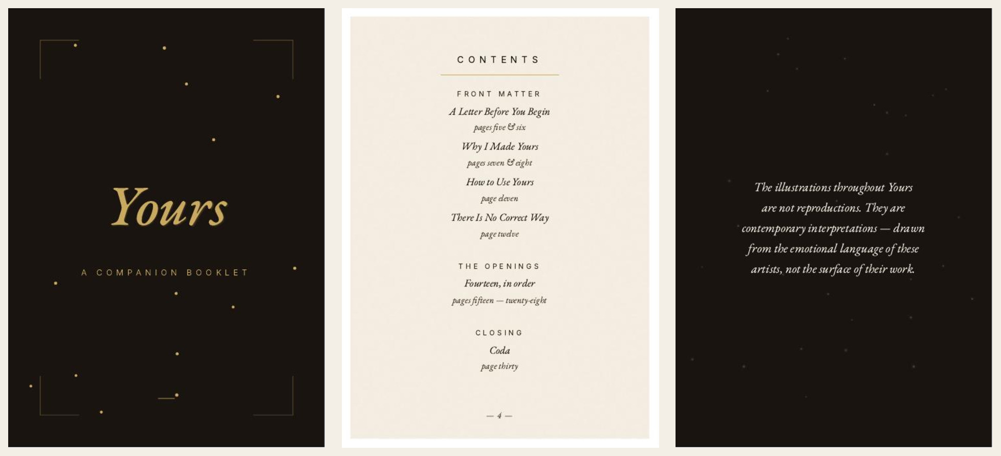
The interior runs cream almost end to end. Two pages go full-bleed warm-dark, and both are thresholds: the page before the fourteen openings begin, and the page before the closing letter. They exist to make the reader slow down at the two moments that matter. A third dark page would have turned a threshold into a pattern. The cost is fewer moments of emphasis, so that the two that remain keep meaning something.
The dark is a near-black with brown in it rather than a flat black, because a flat black reads cold and this object is not cold. Warmth in the ink is what keeps a dark page feeling like velvet instead of like a hole in the paper.
The same system, a different set of words.
Yours is built on a single principle: the mother is always the subject, and the recipient changes. That is what lets the line grow without losing its centre.
Beginnings and Beginnings · The Two of Us run on the identical grid, type scale and palette. What changes is the writing. Each product has its own openings, written for its own occasion — the fourteen in A Book of Letters are a mother writing to her child, and neither of the other two reuses one of them. The system carries the structure; the content is authored per product. Designing the second and third products was the test of whether the first one had produced a system or only a layout.
The one visual difference is where the illustration sits. In A Book of Letters the drawing falls under the title. In these two it sits above it, so the title lands last and the card reads as an arrival rather than an instruction. Beginnings holds first moments and transitions at any age. The Two of Us is a dual set of two identical halves, written across a first year and exchanged at an anniversary.
Both are designed. Neither is shown here in full. Further sets are in design, each one a different occasion on the same system.
The shape changed twice before it was right.
The format was locked in May as a clamshell folio holding loose cards — chosen over a bound book because loose cards can leave and a bound book cannot. The final edition is a box. The reasoning survived; the object did not.
The set was also going to include a pad of first versions, specified to reduce the anxiety of writing something permanent. It is not in the edition. That job moved into the companion booklet, where one finished example does the same work without adding another object to the box.
One decision from that week did hold, and it is the one the rest of the line depends on: the product is called Yours, with no occasion attached to the name. A set named for an occasion can only ever serve that occasion.
What exists, and what it proves.
The interface was not a screen.
Designing something meant to be kept changed how I think about product work. The flow was the sequence of opening a box, choosing a card, reading an opening, seeing someone else's handwriting, and finally writing your own. Every one of those is an interaction, and none of them could be patched after release.
Product design is not defined by the presence of a screen. The user still has a constraint. The experience still has a sequence. Hierarchy still decides what gets noticed first. And every decision still carries a cost. The one thing paper changes is that there is no second release to fix it in.