Cutting PDF download bloat for contract reviewers.
Choosing daily users over the loudest CX complaint, and shipping granular controls before smart presets.
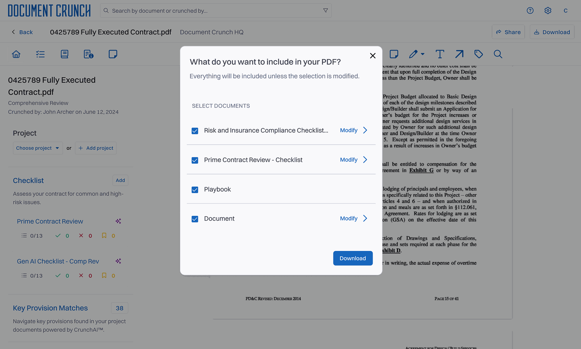
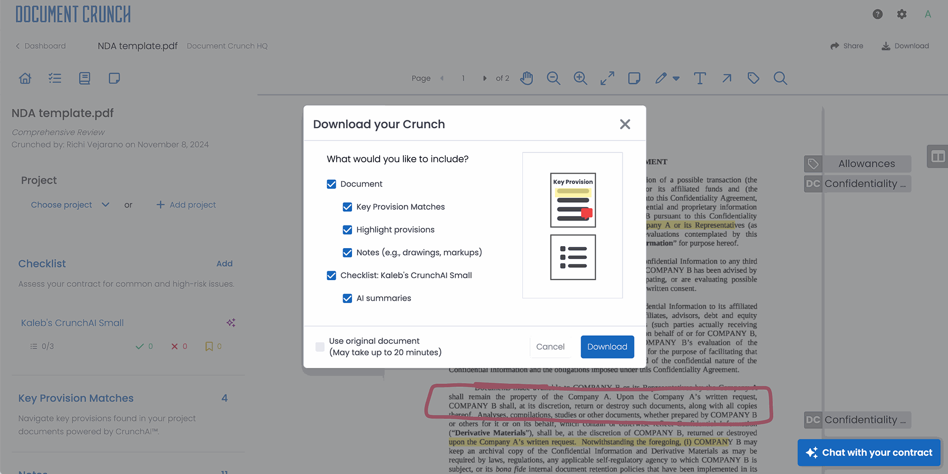
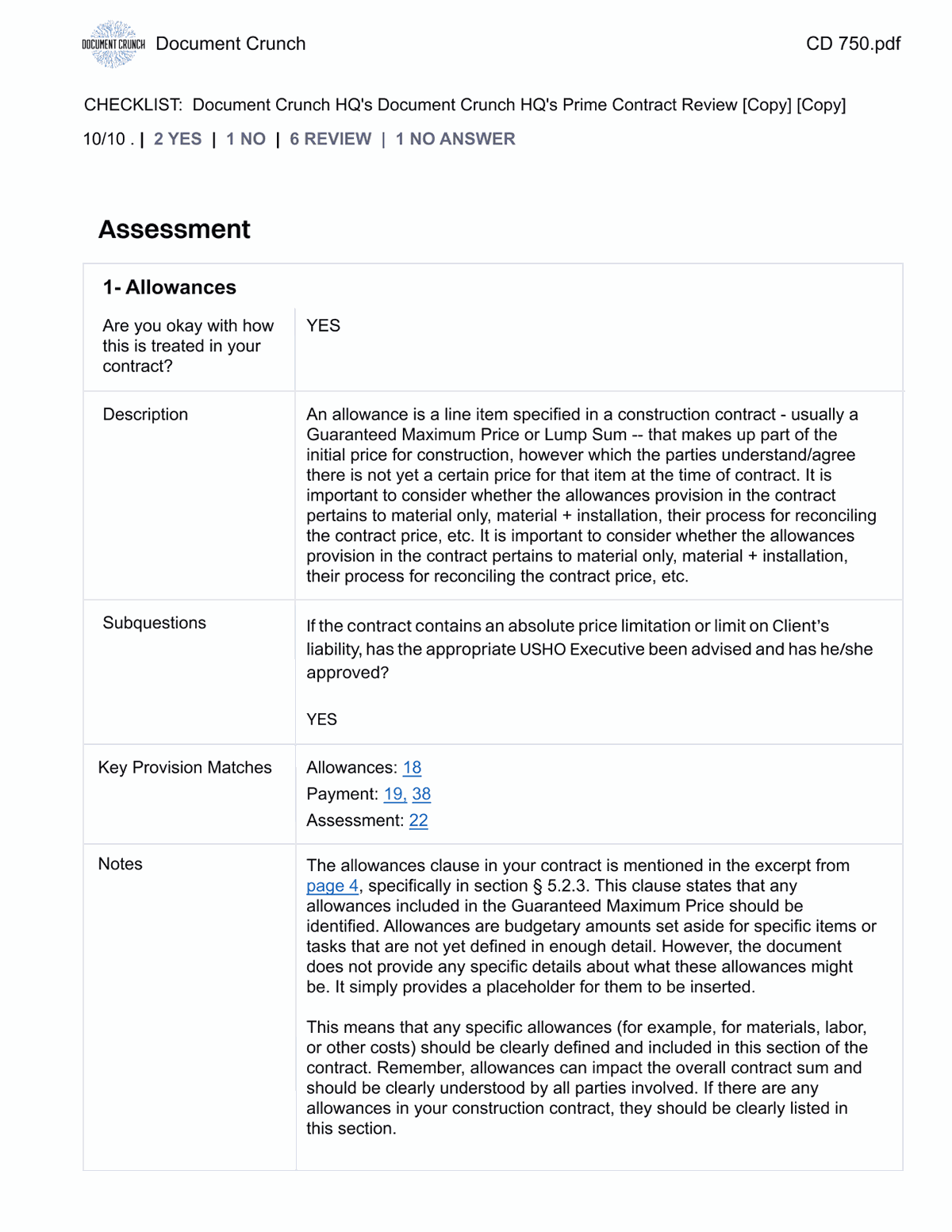
The selection modal users see when they hit Download — checklists toggled on or off, with a live page-count preview that updates as they make choices.
Document Crunch is an AI-powered platform used by construction-industry legal teams to assess risk and review complex contracts. Users apply checklists, leave notes, and mark up contract PDFs directly inside the app — replacing a manual, error-prone review process that previously happened in Word, email, and Adobe.
After a multi-checklist feature launched, a quiet but expensive problem surfaced: every download carried every checklist, note, drawing, and markup attached to that contract — even the ones the recipient didn't need. Files ballooned. Email clients rejected them. Recipients scrolled past pages of internal annotations to find the clauses that mattered.
A surface complaint masking three distinct jobs-to-be-done.
Customer Operations was fielding repeat complaints, but the surface complaint — "the PDF is too big" — wasn't the real one. I worked through the inbound feedback with CX and ran short interviews with five daily users to understand why people were downloading in the first place. Three jobs-to-be-done emerged.
Sharing the contract with someone outside the platform — a partner, a subcontractor, opposing counsel. Printing a specific section for offline review. And quickly re-reading their own checklist or markup work in a single document. Each job needed a different slice of the document. The current export bundled all three.
The real problem wasn't file size — it was that the system gave users no way to express intent.
Three tensions shaped how this work got framed to product and engineering.
What we couldn't change.
- The export pipeline already existed — backend rewrite was off the table for the timeline.
- Users are in the app daily — any new step in the flow had to feel faster, not slower, than what they had today.
- The feature had to work for users with one checklist and users with twenty without two different UIs.
Three directions prototyped. One shipped.
I synthesized CX feedback alongside FullStory session replays to confirm the pattern wasn't anecdotal — users were repeatedly downloading, opening the file, and re-downloading after they realized the file was too big or too messy. That gave me confidence the problem was worth a dedicated flow rather than a settings toggle.
I prototyped three directions. A pre-export settings panel was the first — rejected because it added a step without giving users confidence the output would be right. Smart presets based on download intent was the second — promising, but parked for v2 because we didn't yet have the telemetry to define good presets. The direction that shipped was a focused selection modal with real-time preview.
The preview was the unlock. Once users could see the page count update as they toggled checklists and annotations on or off, the feature stopped feeling like configuration and started feeling like editing. I tested the prototype in Maze with seven users — the preview loop cut decision-time in half compared to the settings-panel direction.
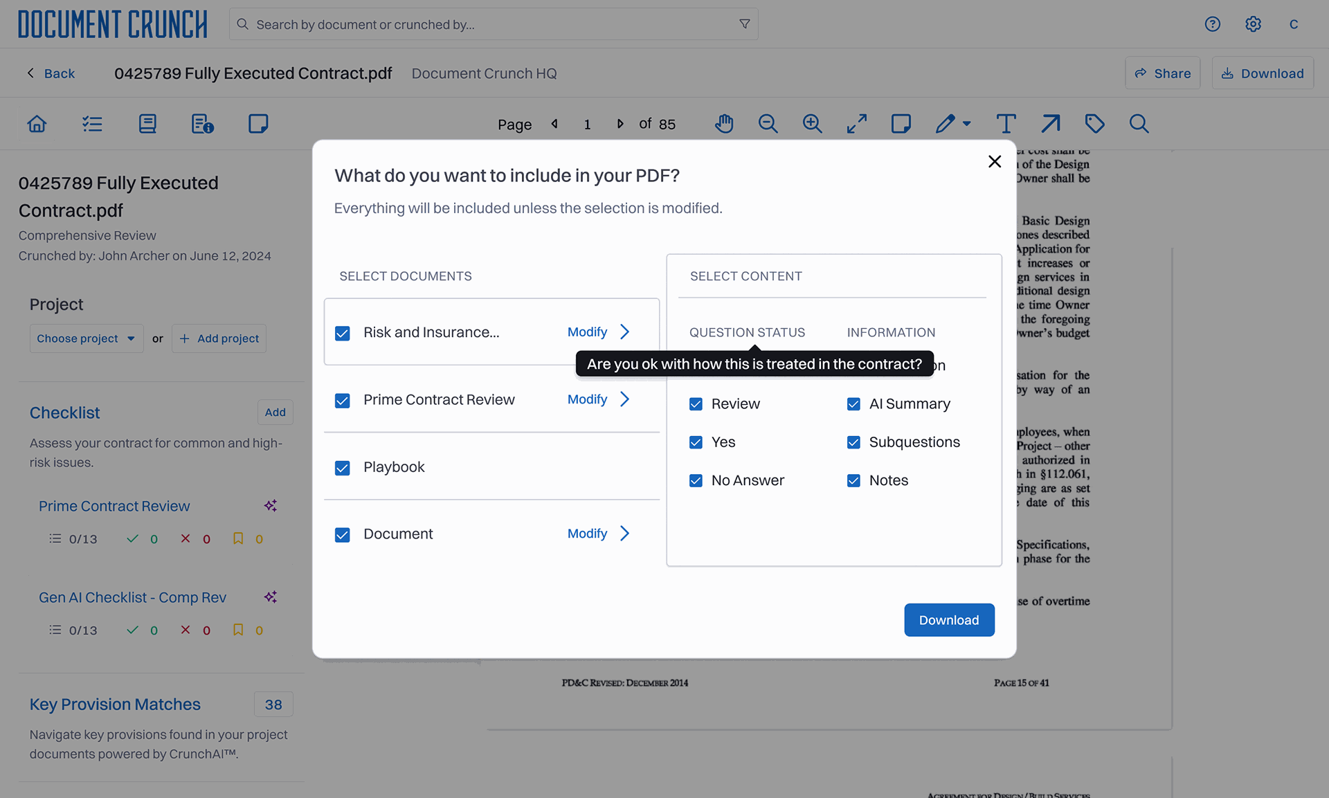
The expanded modal adds a second layer of control: per-checklist toggles for question status and information type. I went back and forth on whether to expose this granularity at all. The deciding factor was that daily users had been doing this manually post-download. Better to give them the controls than pretend the work didn't exist.

A modal, a preview, and the data to build what comes next.
A modal — not an inline panel, not a side drawer — because the action is intentional and discrete; users come to download, then return to reviewing. Inside it, real-time preview rather than final-screen preview because the cost of guessing wrong was always the original problem. And per-user defaults rather than global ones because reviewers' checklist preferences turned out to vary more by reviewer than by contract type. The second download of the same contract is now one click.
The biggest risk was performance: real-time preview meant re-rendering thumbnails as users toggled, and the existing PDF pipeline wasn't built for that load on long contracts. I worked with two engineers to scope a preview pattern that felt instant for typical contracts and degraded gracefully on outliers — a deliberate trade-off rather than a one-size-fits-all approach. Post-launch usability sessions confirmed the modal didn't introduce new confusion.
The redesign shipped and stuck.
A few signals I can speak to directly:
Granularity is seductive. My first prototype gave users toggles for individual notes and individual drawings — and it tested badly.
From the project retrospective
Start at the coarsest grain.
My first prototype gave users toggles for individual notes and individual drawings — and it tested badly. Users wanted control, not every possible option. I should have started one level higher — checklist-level toggles — and only added finer granularity if testing demanded it.
I now default to asking "what's the coarsest grain that solves the job" before adding controls. This project made that reflex concrete.
Three threads in motion.
Default presets for the three jobs-to-be-done are now in design — built on the toggle-usage telemetry the v1 release generated. Batch export across multiple contracts is on the engineering roadmap. And the visual hierarchy improvements within long checklists — which kept coming up tangentially during preview testing — have become their own small initiative.