Putting clinical trial patients in the loop.
Card-based architecture as the answer to reusability-vs-specificity. Mobile-first, security-first. Built for patients whose relationship with the word "clinical trial" is already complicated.
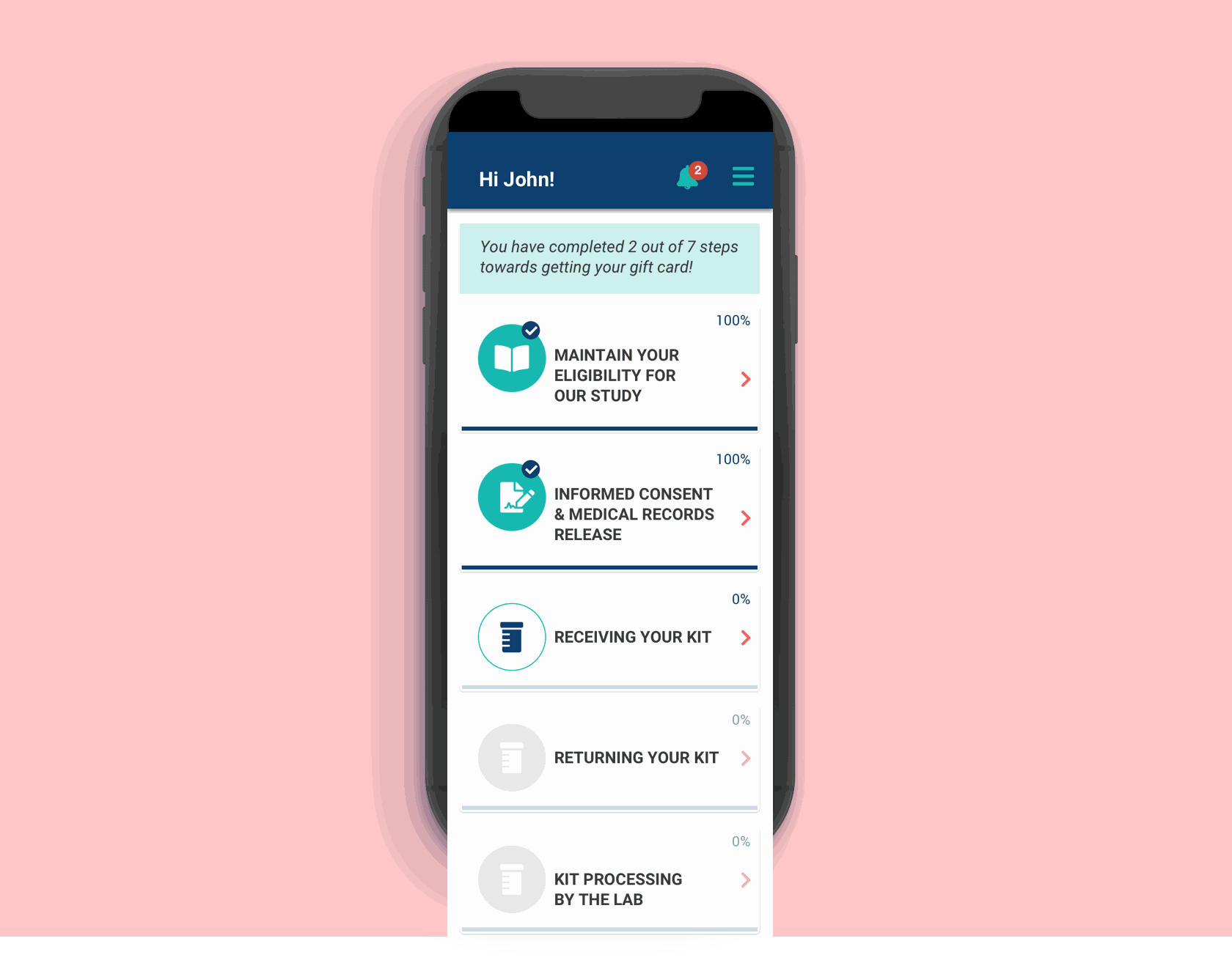
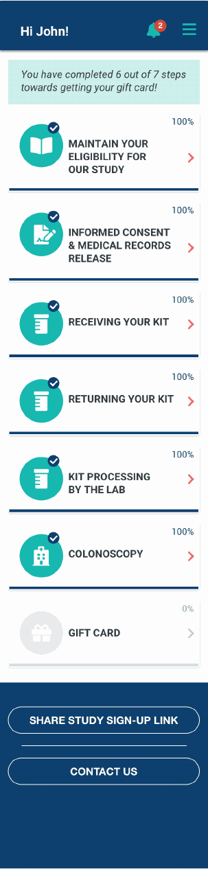
The Study Tracker home screen. Card-based progress through every step of a study — one place where patients see what's done, what's coming, and what changed.
83 Bar's recruitment work brings patients into clinical trials, but the relationship doesn't end at sign-up — patients move through tasks, kits, and protocol checkpoints over weeks or months. Without a dedicated tool, that journey lived in emails, phone calls, and the patient's own anxious guesswork.
The Study Tracker app was built to give patients a real-time view into their study — what's done, what's coming, what changed — and to let them communicate directly with the team running it. The design challenge was doing this across a wildly varied patient population, at a mobile-first form factor, against a six-week clock.
Trial patients tolerate uncertainty better than they tolerate silence.
Patients need to be in control of the process in real-time, to easily receive and deliver information to stakeholders, and to facilitate communication.
Project brief
Translating that into design problems: patients couldn't see their own study progress without contacting an agent. Communication was asynchronous in the worst sense — slow, one-directional, and easy to lose. Protocol changes happened, but patients often heard about them later than they should have. And users were technically varied — the app had to work for someone confident with a smartphone and someone who isn't.
Three architectural decisions made before the first screen.
Four decisions that defined the product's architecture.
- Card-based study process — each step of a study lives in a card: current, upcoming, completed. Patients see where they are and what's next without scrolling through a wall of text. New study, different cards, same architecture.
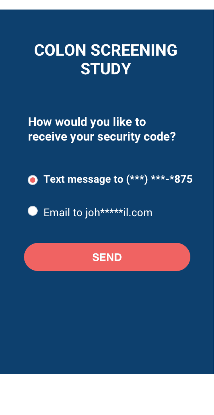
- Two-factor authentication designed to feel familiar — similar to banking apps the persona already used. Security without friction.
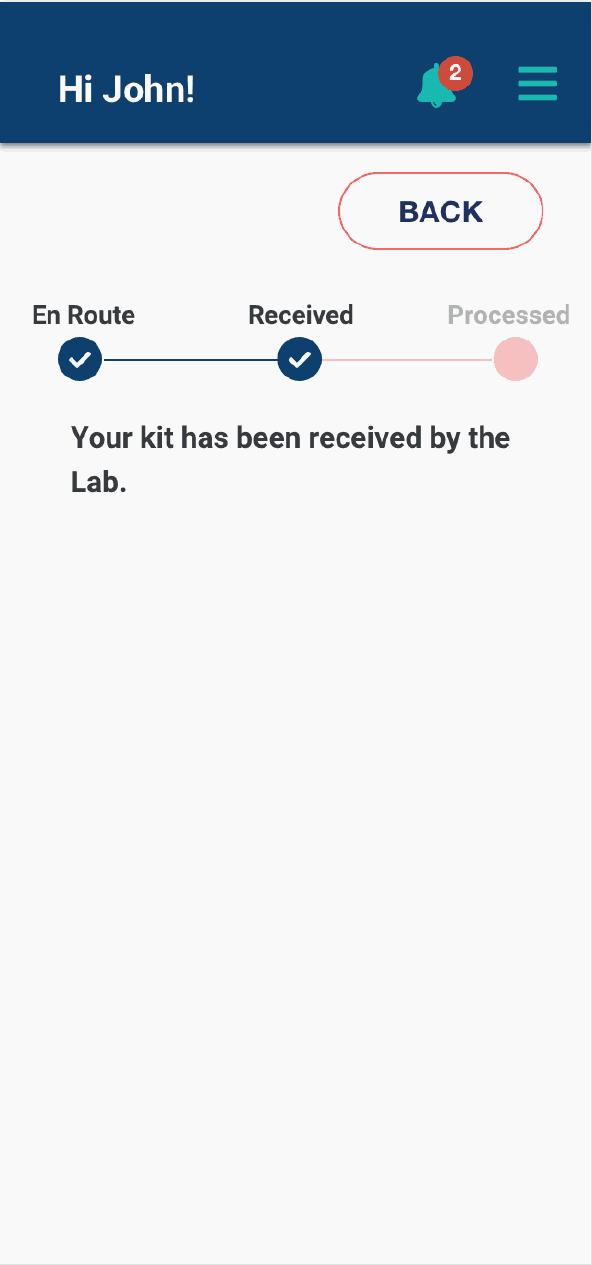
- Kit-in-process screens for the moments when a physical test kit is in transit, with status that updates without the patient having to refresh or contact someone.
- Mobile-first with desktop parity — the mobile experience carries the trust-critical moments; desktop carries the longer review and data-entry sessions.
Launched in February. The architecture proved its thesis.
The 1.5-month timeline forced me to ship before doing usability testing with the most vulnerable users. That's now my top accessibility priority for v2 — but I should have negotiated harder for the time.
From the project retrospective
Negotiate harder for accessibility testing time.
The card structure works well for the typical persona. I haven't yet validated it works for someone using a screen reader or one-handed input — and I shipped without that knowledge. That gap is now a structured next step, but I should have pushed for a one-week extension in the original timeline to include those users in the validation pass.