Rebuilding the Call Center app to keep nurses on the call.
Trading data-model rework for experience redesign to hit a 3-month timeline. Cognitive walkthroughs during real patient calls.
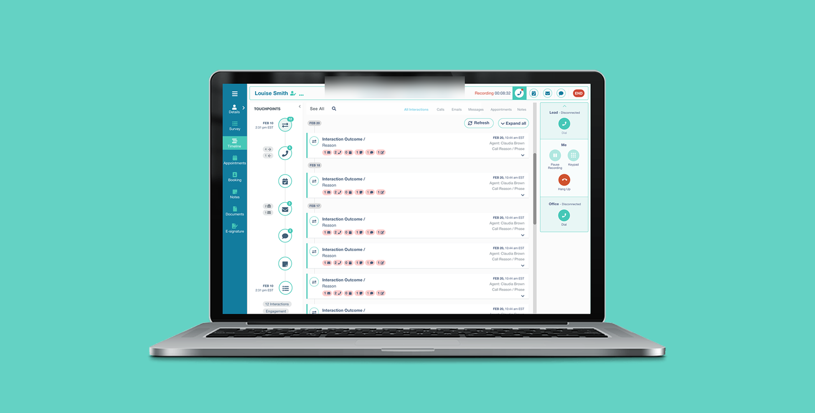
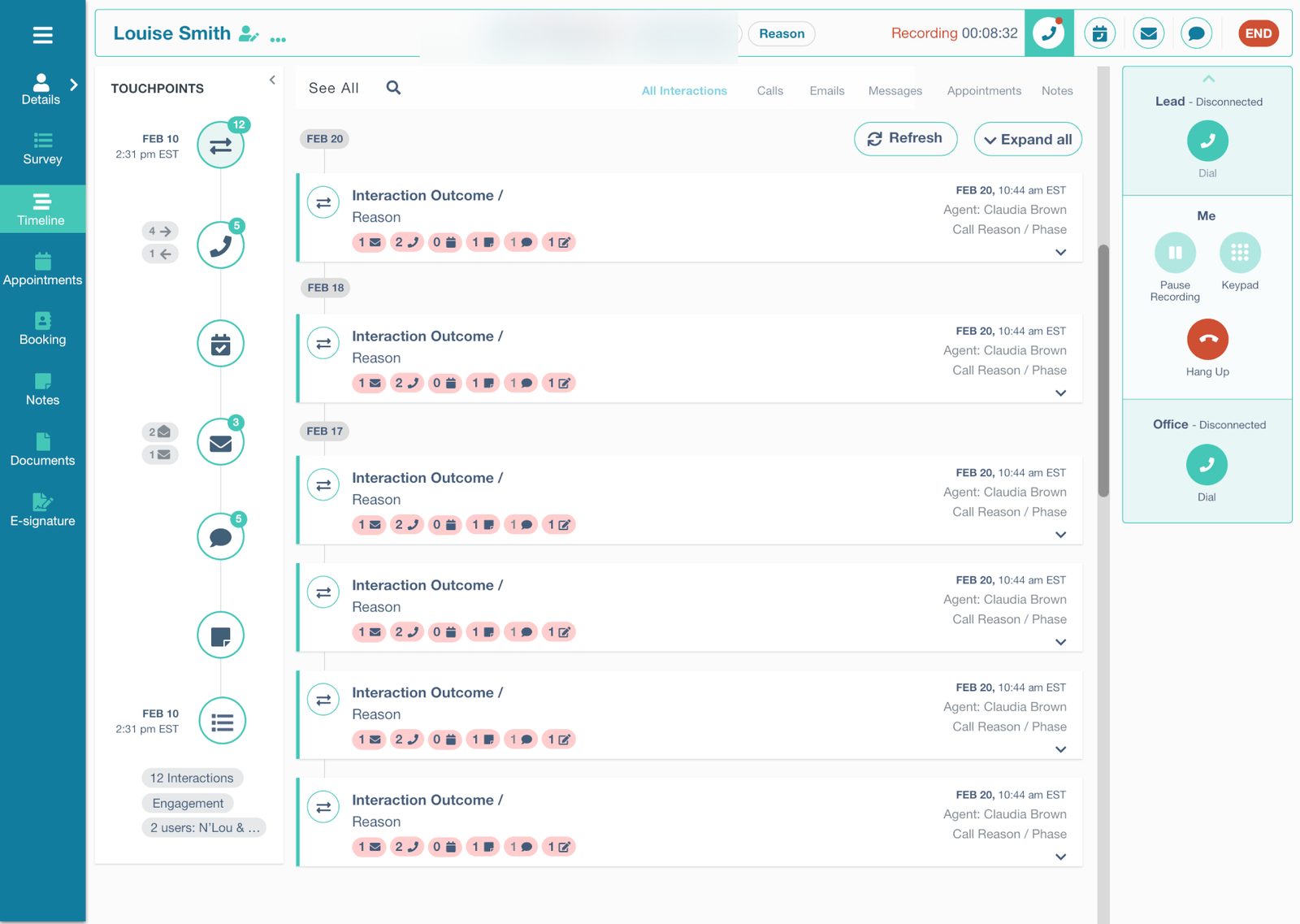
The redesigned Call Center dashboard. Patient context, timeline, and call controls all live in a single view — no more navigating between apps mid-call.
At 83 Bar, dedicated nurses and Call Center agents contact, educate, and recruit patients for clinical trial studies. They work the phones for full shifts, juggling lead profiles, scripts, screening questions, and a separate scheduling app — frequently on a single laptop screen.
The existing Call Center app had grown unmaintainable. New agents struggled with navigation. Technical glitches interrupted live patient calls. Turnover was high and complaints were a steady drumbeat. Leadership asked for a rebuild that would actually stick.
Every second a nurse spends fighting the tool is a second she isn't talking to a patient.
Nurses are constantly annoyed when using the app because they can't easily find the necessary information.
From a cognitive walkthrough, early research phase
Agents were running three or four applications simultaneously during every call. Information was fragmented — agents stitched patient context together in their heads. Access was slow; the old timeline buried critical information. Data transfer between apps was clumsy enough that agents often asked patients to repeat themselves. And handling an incoming call meant navigating between two different apps before the agent could even greet the patient.
Three decisions made before the design started.
Four user attributes that anchored every decision afterward.
The cognitive walkthroughs gave me a clear picture of what agents actually needed. Limited screen space — agents aren't going to get a second monitor. Wildly varying technical proficiency — designs need to work for both ends of the range. Visual simplicity wins; dense information panels lost in testing every time. And agents wanted more information about each lead, not less — but presented selectively, surfaced on demand.
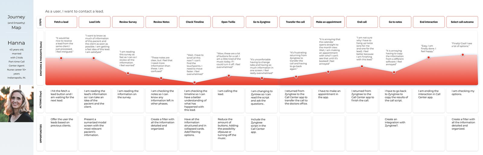
I built a journey map for the primary persona — Hanna — tracing the full arc of an agent's interaction with a single lead. That map became the reference document the team kept returning to in design reviews when scope debates got abstract.
What I borrowed and what I deliberately left behind.
I benchmarked against seven call-center products to map what good looks like and where novel patterns might fit. The goal wasn't feature parity — it was finding patterns that reduce cognitive load during live patient calls.

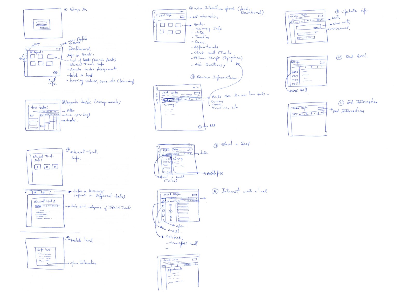
Wireframes before pixels.
Three constraints framed the design space. Three months from kickoff to MVP launch — non-negotiable, tied to a recruitment cycle. The existing data model couldn't be rewritten in scope. And the solution had to coexist with the Agent Scheduling App that managers depend on.
Five anchoring decisions that everything else flowed from.
- A streamlined timeline that prioritizes key events first and demotes the rest into a progressive disclosure pattern — reducing what's on screen at any given moment was the single highest-impact change in usability testing.
- Integrated data transfer — copying lead information between the app and adjacent tools became a first-class action, directly addressing the "asking patients to repeat themselves" problem.
- Unified call handling — lead context lives inside the call interface rather than on a separate screen. The alternative was a "switch to lead view" pattern I'd seen in benchmark products, but every navigation step during a live call is an opportunity for the agent to lose their place in the conversation.
- Information-on-open — the most-used patient context appears the moment the app opens, no profile navigation required. The cognitive walkthroughs had shown agents doing rapid pattern-recognition on lead status within the first seconds of a call connecting; the existing flow buried that information behind a click.
- A card-based dashboard, tailored per role — agents and managers see different cards because their jobs differ, but the card system itself is the same component underneath. The trade-off I made early — designing one composable system instead of two parallel apps — meant feature work that benefits both audiences ships once instead of twice.
MVP launched in June and stayed in production.
I underestimated how much adjacent context — the scheduling app, external CRMs — shaped the agent's screen. The MVP solved problems inside our app beautifully. The next set of complaints turned out to be about the seams.
From the project retrospective
Map the agent's full screen, not just our slice of it.
If I were starting again, I'd map what the agent has open across all windows in week one — not just our app. The seams problem turned out to be the next horizon's real work, and I'd have arrived there faster with a wider initial scope of observation.